When Two Become One
Post-acquisition rebranding for NAS to enter the Chinese market.


Client
North Asia Holdings Limited

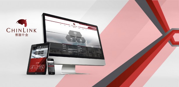
After changing ownership, North Asia Strategic was looking to rebrand in order to enter the Chinese market. Chill worked on many aspects of the company in order to appeal to Chinese preferences: we shortened the brand name to make it easier to remember, and the new logo includes the color red and Chinese characters. We also revamped the company website by reorganising the information architecture to increase ease of navigation, and we emphasized graphics over text-heavy content.